IELTS Writing Task 1 · Pie chart

Bài mẫu IELTS Writing Task 1: Biểu đồ tròn #185

Biểu đồ tròn 20 phút · tối thiểu 150 từ Bài mẫu 6.0 Bài mẫu 7.0 Bài mẫu 9.0 trong app

Đề bài

You should spend about 20 minutes on this task.

IELTS Writing Task 1 Pie chart: Biểu đồ tròn #185 IELTS Writing Task 1 Pie chart: Biểu đồ tròn #185 Viết ít nhất 150 từ trong khoảng 20 phút.

Dàn ý gợi ý cho dạng Pie chart

Xem tất cả đề dạng Pie chart →

Biểu đồ tròn thể hiện tỷ lệ các phần trong một tổng. Thường có 2–3 biểu đồ để so sánh giữa các năm hoặc các nhóm.

  1. Mở bàiParaphrase đề: tỷ lệ của cái gì, ở nhóm/năm nào.
  2. OverviewPhần chiếm tỷ trọng lớn nhất và thay đổi lớn nhất giữa các biểu đồ.
  3. Thân bài 1Các phần lớn, so sánh giữa các biểu đồ.
  4. Thân bài 2Các phần nhỏ hoặc thay đổi đáng chú ý.
  • Đa dạng cách nói tỷ lệ: a quarter, just under half, the vast majority.
  • Dùng account for, make up, constitute thay cho is.
  • Không cộng dồn hay suy diễn số liệu không có trên biểu đồ.

Bài mẫu band 6.0

168 từ. Bài đủ ý, bố cục rõ, từ vựng và ngữ pháp ở mức an toàn: đây là mức nhiều bạn cần để đạt mục tiêu 6.0.

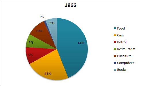
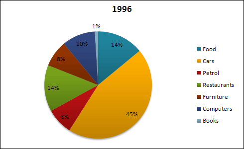
The two pie charts show how spending was divided between seven categories in 1966 and 1996. The categories are food, cars, petrol, restaurants, furniture, computers and books.

Overall, food was the biggest area of spending in 1966, but in 1996 cars became the biggest. Spending on computers and restaurants increased, while spending on food and books decreased.

In 1966, food made up 44% of spending, which was almost half. Cars were the second with 23%, and furniture was 10%. Petrol was 9%, restaurants were 7% and books were 6%. Computers had the smallest share at only 1%.

In 1996, the situation was very different. Spending on cars nearly doubled to 45%, and it became the largest category. In contrast, the share of food fell sharply to only 14%. Restaurants doubled from 7% to 14%, so they had the same share as food. Computers also increased a lot, from 1% to 10%. However, books dropped from 6% to just 1%, and furniture and petrol fell slightly to 8% each.

Bài mẫu band 7.0

175 từ. So với bài 6.0: lập luận sâu hơn, từ vựng chính xác và đa dạng hơn, câu phức dùng tự nhiên hơn.

The pie charts compare the proportions of spending on seven categories in 1966 and 1996.

Overall, the pattern of spending changed considerably over the thirty-year period. Food, which accounted for the largest share in 1966, was overtaken by cars as the main expense by 1996. Spending on restaurants and computers also increased significantly, whereas the share devoted to books fell sharply.

Còn 2 đoạn của bài 7.0 và bài mẫu band 9.0

Đăng nhập miễn phí để đọc trọn bài, so sánh 3 mức band và viết thử ngay trên đề này.

Đọc tiếp trong app